The web design industry goes through many changes almost every year in order to stay inspiring and innovative. This year too, the industry has much more to offer to companies in terms of creating visually attractive websites that will leave a lasting impression on the users. Therefore, we present the top five emerging web design trends to watch out for this year.

1. Mobile First Approach Adopted By Brands
As the name suggests, mobile first approach means designing a website that is easily accessible on devices with miniature screens such as mobile phones and then focusing on bigger devices such as computers. Although this approach is not very new but with mobile phones declared as the most widely used medium for browsing and exploring the web; a plethora of brands are embarking on the project to develop a website that delivers design and content on a smaller screen.
2. High Quality And Original Images
Stock photography used for commercial design purposes are soon to face decline as many people have started losing interest in them. They are now considered clichéd for businesses’ web design as top quality images are easily available on various professional photography sites. Research has suggested that images which feature people in real time leave a far better impact on the brand’s target audience and entice many visitors to the website. An increasing demand for candid and natural images is emerging as people can easily relate to them. Thus, to engage and attract customers to their website, brands are now including well captured yet original pictures that can depict their website’s visual story.

3. Return Of Gradients
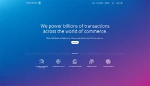
Although gradients disappeared from the design arena a couple of years ago, year 2017 has marked the return of gradients, however with a twist. The colour blurring technique used in gradients is now replaced with inclusion of various vibrant colours. Moreover, a trend of big and bold gradients is now in place. The most popularly used gradients are those that have a two colour overlay on pictures. This technique will be ideally used for making dull and less interesting photographs more visually attractive.
4. Minimalism
In 2017 the trend has moved from heavy and elaborate home pages to simple web design styles. Furthermore, sometimes web design styles present visitors with a card layout that can be accessed to explore more pages for a better user browsing experience. Multiple cards can also be used on the website to visually suggest a topic and encourage the users to open different pages they like. The most appealing aspect of cards is that they create flexibility, simplicity, responsiveness and organisation.
5. Simple And Straightforward Text
There are certain companies that are cutting out images and navigation sections from their website to educate the users about their product or service. This modern and uncluttered approach is used by some companies to disseminate only basic and important information while adding more links to their portfolios.
6. Customised Illustrations
Bespoke illustrations are gaining momentum in 2017 as many companies are seeking services and advice of illustrators and graphic designers to create unique illustrations for their website. Adding illustrated touches as opposed to flat design is indeed a good way to add creativity and innovation to your website.


